Medium is a place where anyone can publish their ideas and find an audience among 170+ million readers on the platform. While there is an abundance of quality content on the platform, readers sometimes found it hard to discover stories from writers and publications they enjoy. This also meant that creators (writers and publications) found it challenging to build an audience on Medium. The existing content distribution model was no longer serving readers and creators well, which harmed the product experience and impacted the business’ growth. To address this, we set to overhaul the content consumption experience, starting with the app.
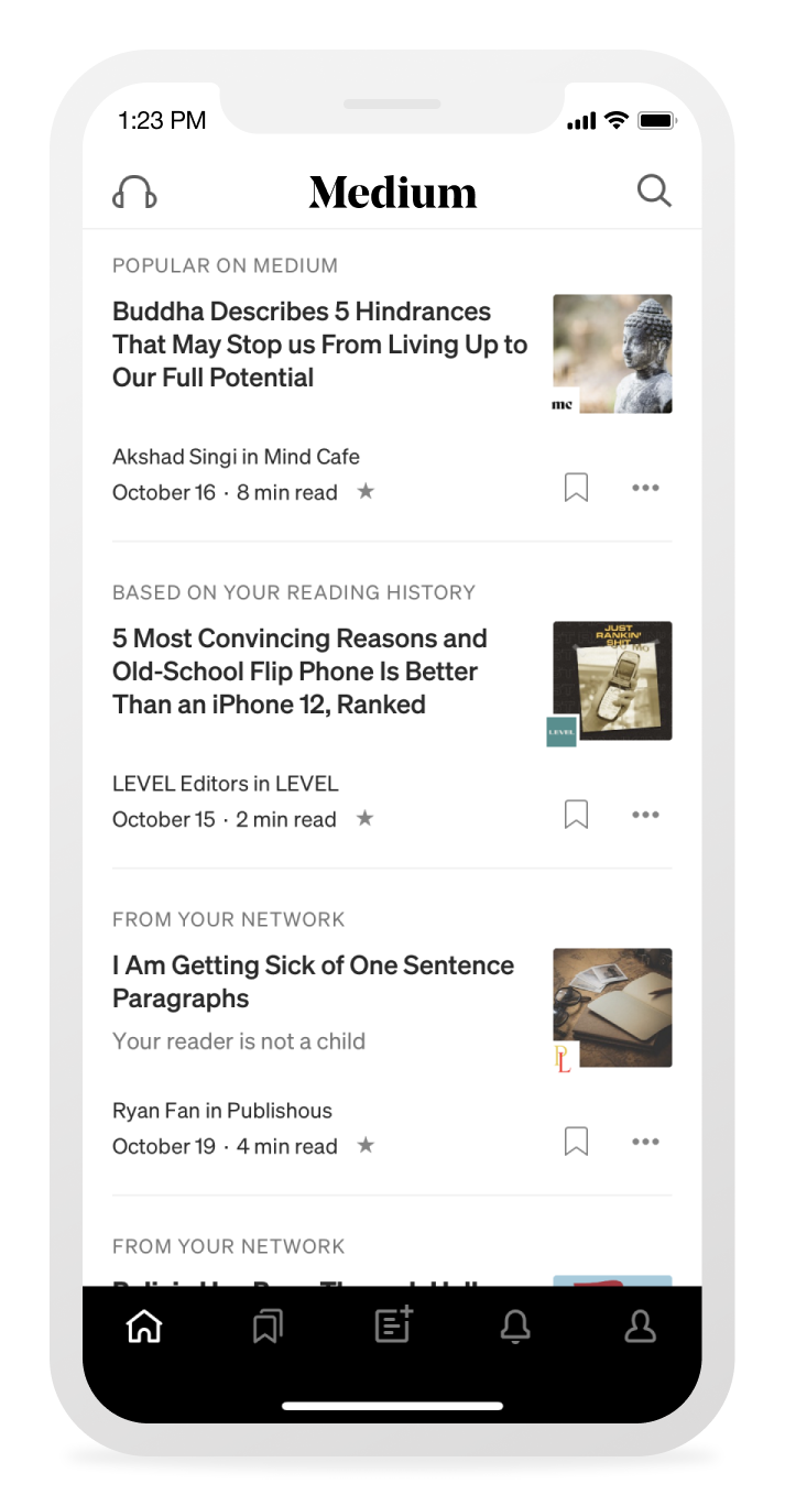
Users find Medium content from both internal sources (e.g. medium.com homepage, app, email digests) and external (e.g. social media, messaging, email). App users are a smaller group compared to web users, but they also tend to be more engaged with the product, i.e. they use the product more frequently, read more stories, etc.
The existing app relied heavily on algorithmically-ranked stories in a feed, which worked relatively fine in the past. It served millions of users and drove a significant part of the business (via paid subscription). Over time, however, the content distribution had become more transactional and less relational, which led to more headline-driven content and less robust discovery.
This is an especially important consideration for paying members, who are at risk of attrition if they no longer find value in the content that Medium has to offer. Given that app users are smaller in number yet more highly engaged overall, we decided that the app would be a good place to test out our ideas before rolling out more globally.
We started off with a “north star” design sprint to create a vision for the app experience. I led the overall effort and collaborated with three other designers from both the reader and creator experience groups. We focused our explorations on key surfaces (app home, writer/publication home, and story page) and investigated the following themes:
- Discovery
How might we help readers explore and discover content that’s relevant to them and encourage them to build ongoing relationships with entities they find interesting? - Sense of place
How might we convey a sense of place, brand, and trust for both readers and creators (i.e. writers & publications) on the platform so they continue to find value in Medium? - Story reading
How might we make reading stories more efficient and fluid so readers can discover more content with less friction?
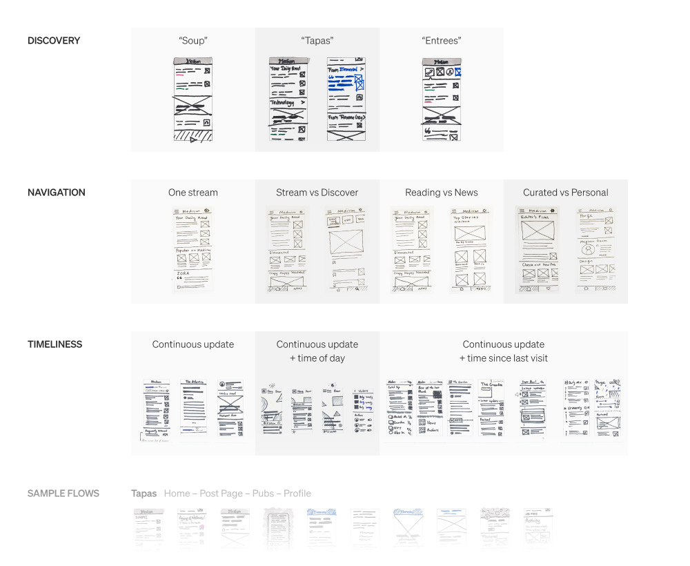
Designs by Andrew Johnson, Hilla Katki, Matthew Herzog, and me.
From here, we built a scrappy prototype and shared it with executives (and later with the whole company) to get input and buy-in.
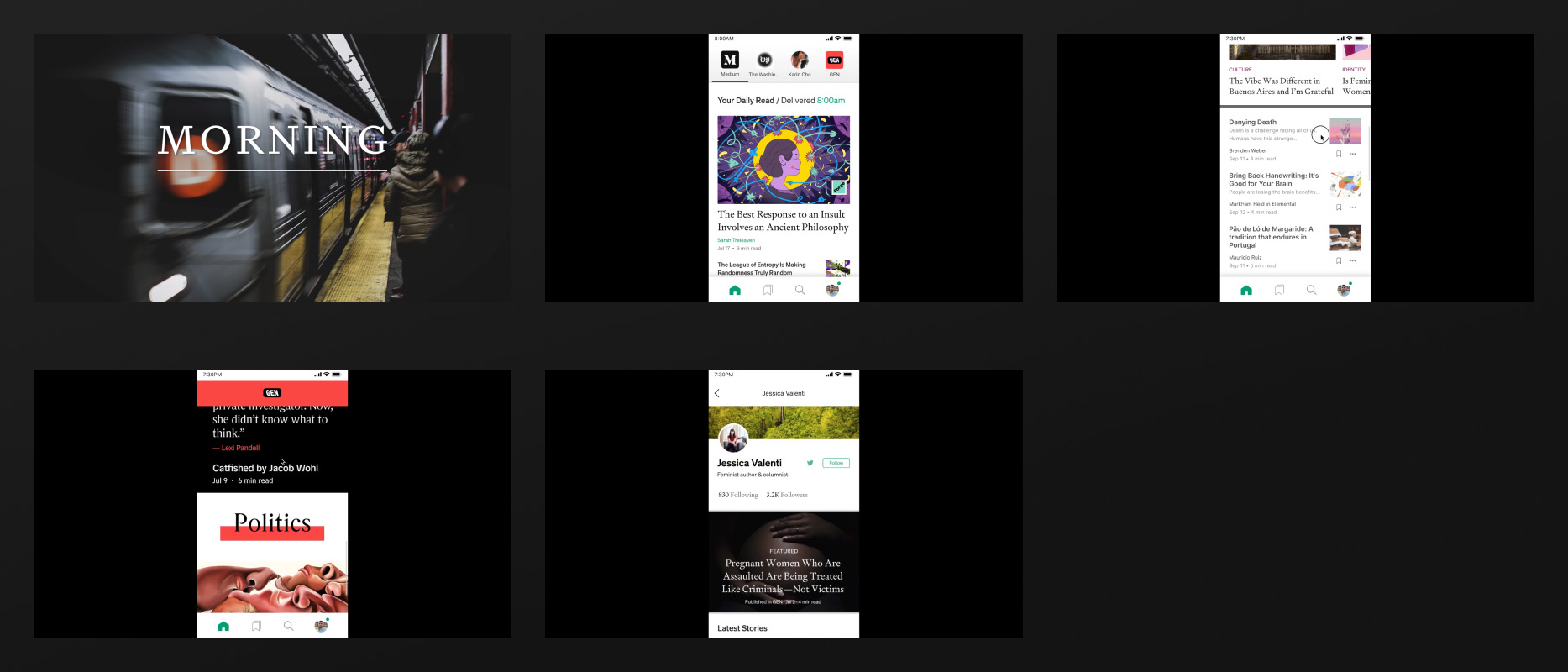
The output from the design sprint helped create alignment across the board and while the resulting designs weren’t final, they pointed in the right direction. Given the scale of this project, we established some core principles to guide us along the way:
- Context
As a reader, I know exactly where I am in Medium’s ecosystem and I can navigate to/from other parts of Medium with confidence. - Continuity
As a reader, I can seamlessly move from one story to another (or from one writer/publication to another) with ease and I’m always discovering something new on Medium. - Completion
As a reader, I feel a sense of accomplishment and learning after spending time on Medium. My time is well-spent and I’m not consuming content endlessly.
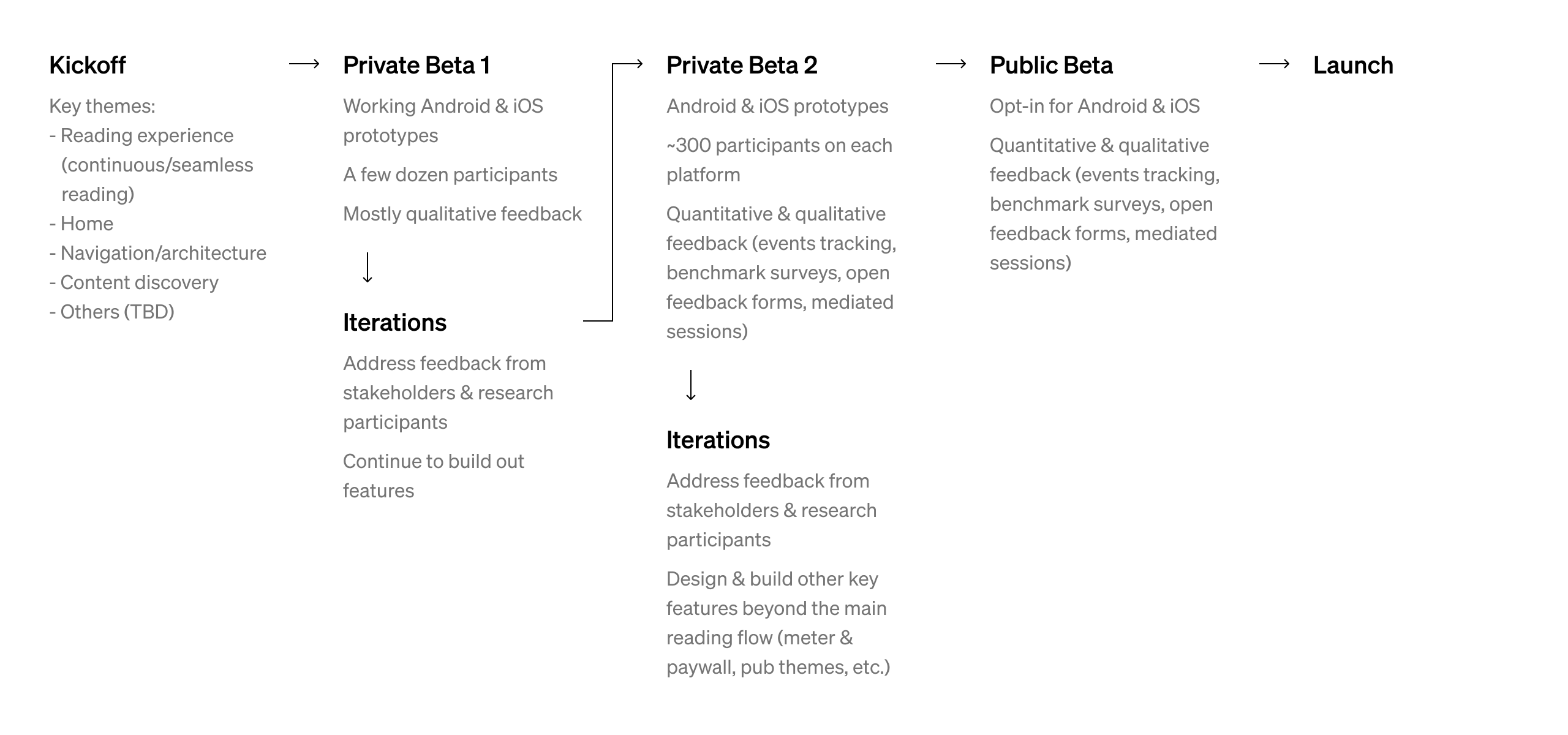
Redesigning a mobile app is no small feat, so to make it more manageable, I worked with product managers to break it down into smaller chunks. By doing this, we could tackle multiple key parts of the experience and work on them in parallel. We also planned out how we would test this with users along the way.
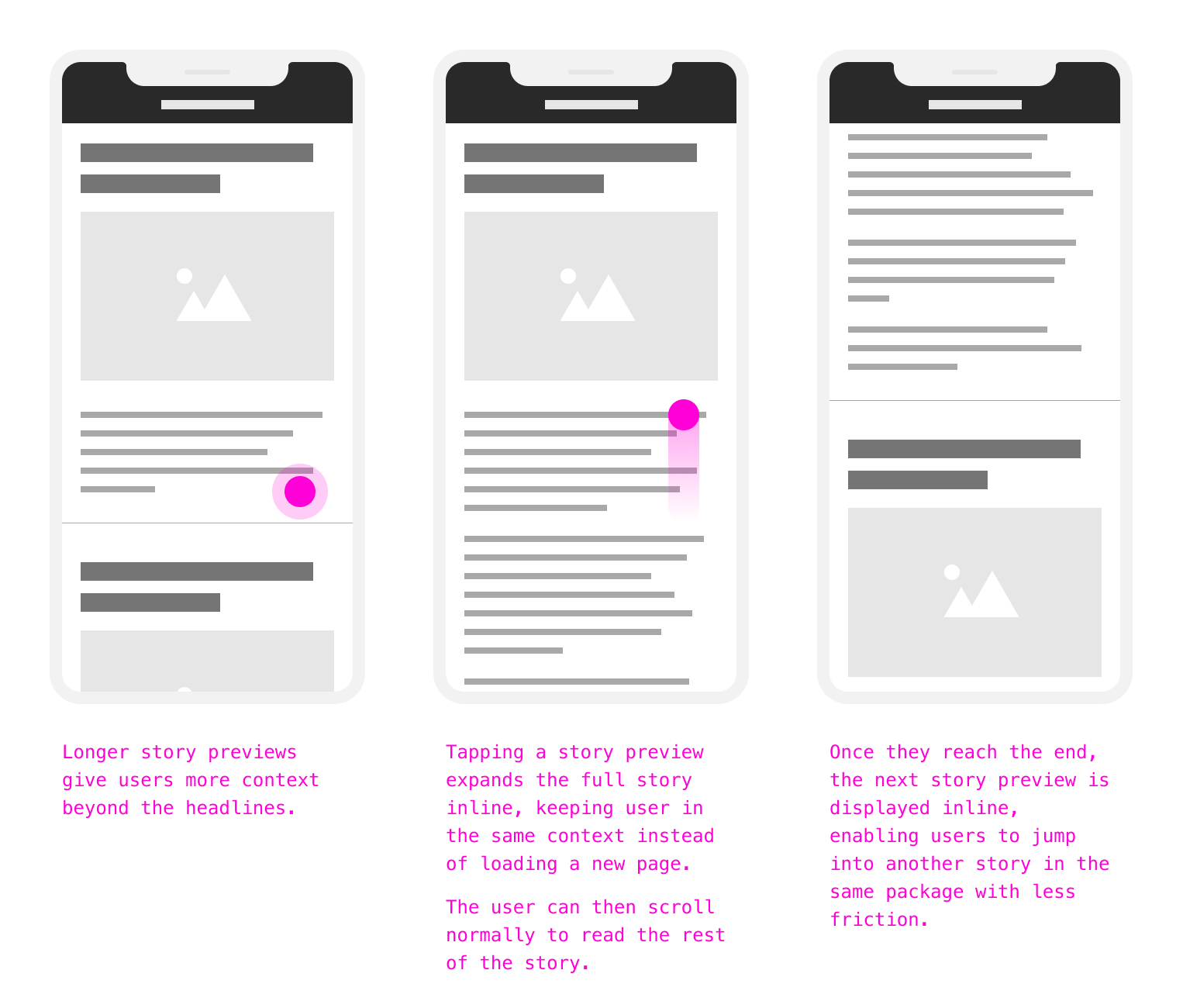
As a product, we want the reading experience on Medium to be as smooth as possible so the user can focus on the content. However, we wanted to make sure that context and continuity are integral to the new experience as well.
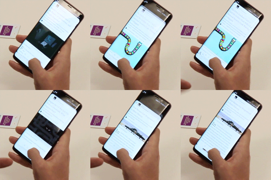
I proposed an initial idea to treat stories like a stack of cards where the user could continuously read one story after another or “skip” to the next story if desired.
This tested fairly well with users, who began using the “next” button as a way to preview stories beyond the headlines. This insight showed us that there was value in a longer story preview, which gave users more context.
After more explorations, we moved away from the “stack of cards” metaphor and simplified it further. We settled on a design where longer story previews were displayed one after another in the context of the writer/publication, and the full story is expanded inline within the same context. By doing so, the story’s context is always clear and the user could seamlessly discover other stories from the same entity simply by scrolling.
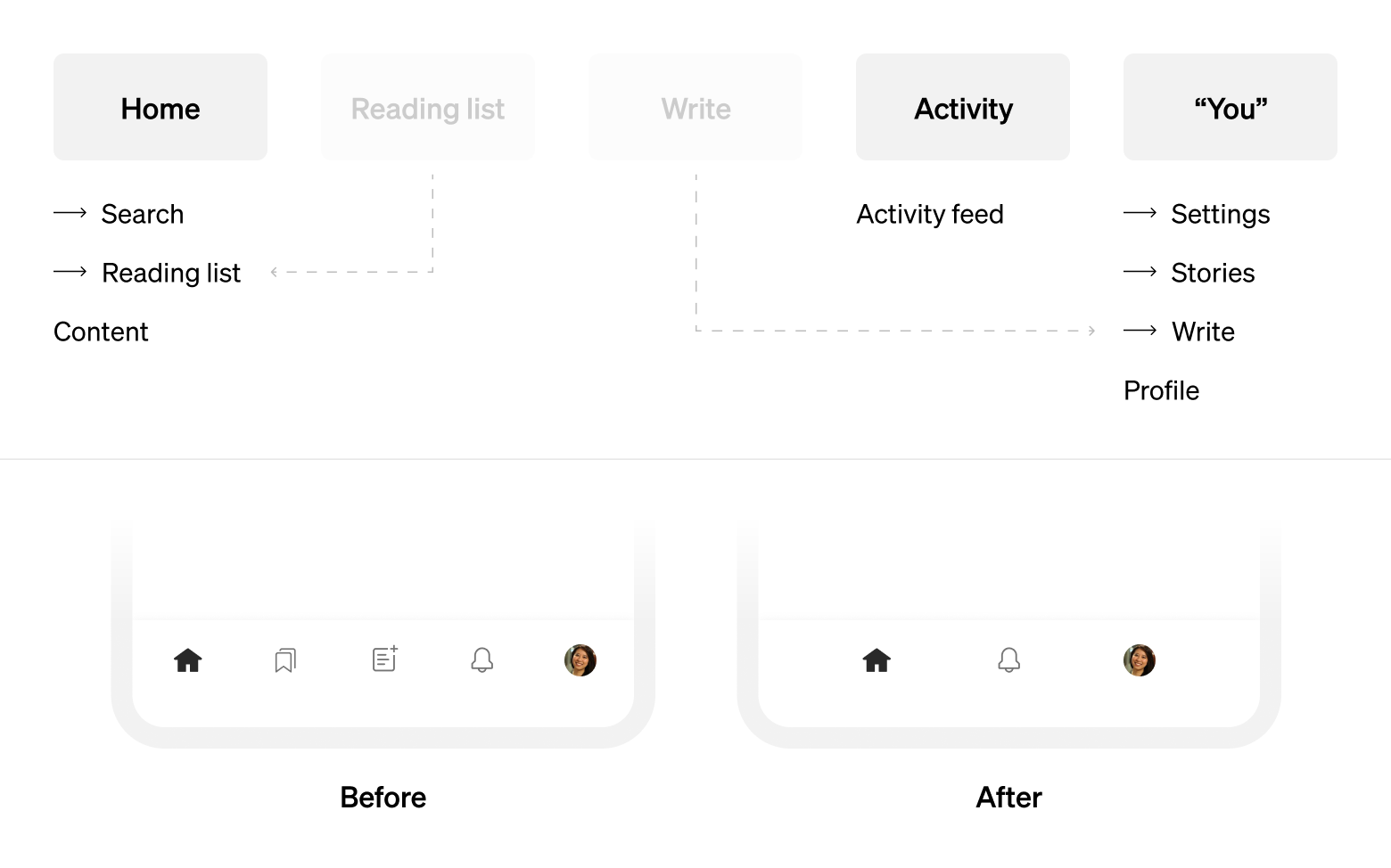
Our data showed that the mobile app was primarily used for reading. Writers and publication editors may occasionally edit their stories or check their story stats in the app, but the majority of creator activities occurred on desktop web. As such, we didn’t think that “write” warranted such a premium placement in the app’s primary navigation bar.
Our data also showed that reading list, a place for the user’s saved stories, was a heavily used feature but only by a portion of app users. We didn’t want to hide it completely, but placing it in the primary navigation bar didn’t seem right for most users either. We eventually decided to tuck it inside app home, which is the first app surface that users see. Thus, users could still easily access the reading list if they wanted to, but those who don’t use reading list aren’t constantly seeing it in the primary nav bar.
App home is essential because it’s the first thing users see when they open the app. The existing home experience relied heavily on the feed, which we wanted to reorient. We started by trying out a drastically different home, which showed writers/publications only (no stories) to reflect the entity-driven thinking. However, this didn’t test well with users (during the first private beta). While this had the potential to surface previously unseen writers/publications, the lack of stories meant that the home surface got stale quickly.
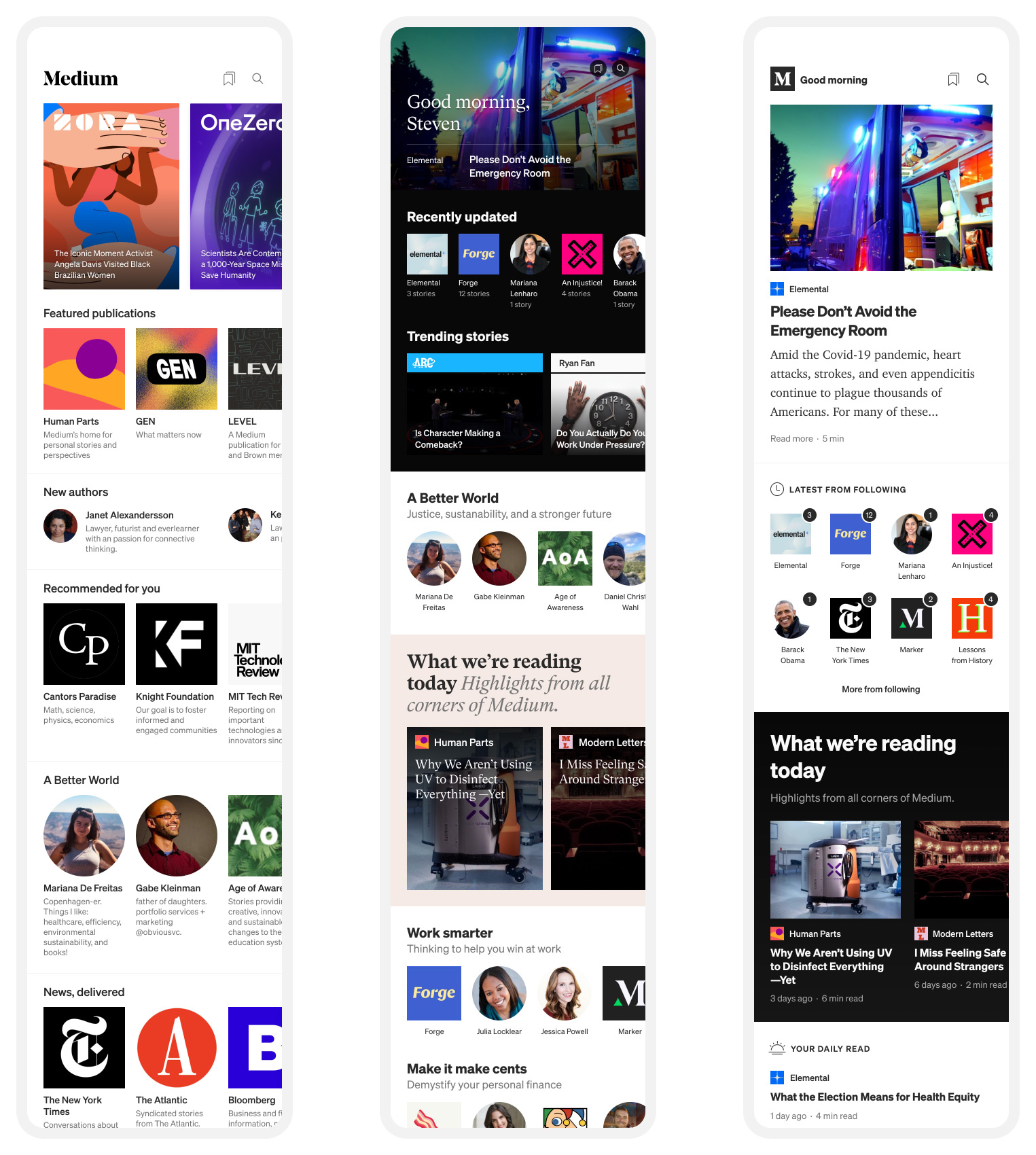
Early designs by Andrew Johnson, later designs by Matthew Herzog and me.
With this realization, we adjusted the design to strike a better balance between stories and entities in the iterations that followed. In addition, we looked into how editorial content could fit within the new home experience.
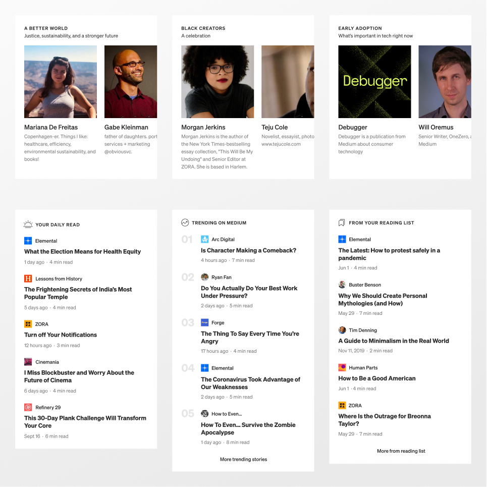
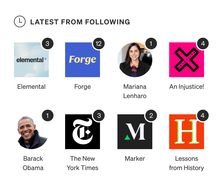
We eventually landed on a version with a more balanced mix of content from the user’s followed entities, recommended and trending stories, editorially selected stories, and curated writers & publications. We also designed the homepage in a modular way that would allow it to scale and become more dynamic in the future.
This homepage was also designed with completion in mind. We prioritized creators that the user follows by listing them first on the page. When they publish, the user sees numbered badges that correspond to those new stories and the user could clear this by visiting the creator’s page and reading their stories. We also removed the infinite feed and let the homepage reach an actual end, which would discourage users from scrolling endlessly.
Research findings from the first private beta group helped shape the design and led us to a more robust version of the product. As we prepared for the second, larger private beta group, we wanted to include both qualitative and quantitative measures so we could get a more holistic understanding. In addition to the ongoing user interviews, we set up an in-app feedback form and programmed events tracking. Researcher Laura Carroll also set up benchmark surveys to measure user satisfaction more broadly and consistently.
From this survey, we saw that a majority of respondents (58%) was either very or somewhat satisfied with the beta version of the app. On the other hand, we also received feedback around story discovery, with one user remarking that “… [i]t’s more difficult to find article suggestions as well as to bookmark to read later.” We knew that moving away from the infinite feed would negatively impact some users who are used to discovering content that way. That said, we also measured other success metrics that would be more indicative of where the product was heading towards strategically.
| Android | iOS | |||
|---|---|---|---|---|
| Members | Non-members | Members | Non-members | |
| Follow rate for writers and publications | Positive | Positive | Positive | Positive |
| Repeat reading from followed writers and publications | Neutral to positive | Neutral | Neutral to positive | Positive |
| Android | ||
|---|---|---|
| Members | Non-members | |
| Follow rate for writers and publications | Positive | Positive |
| Repeat reading from followed writers and publications | Neutral to positive | Neutral |
| iOS | ||
| Members | Non-members | |
| Follow rate for writers and publications | Positive | Positive |
| Repeat reading from followed writers and publications | Neutral to positive | Positive |
Note: “Members” are Medium users who have purchased subscriptions and have access to all stories on Medium. “Non-members” are Medium users who are registered but aren’t subscribed; they can access stories that aren’t behind the paywall, but are limited to 3 stories/month for paywalled stories.
Initial quantitative results suggested that the new app experience drove entity affinity across the board. Users were generally following more creators and reading more content from said creators. It remained to be seen whether this would translate more broadly to all users, but early signs were promising.
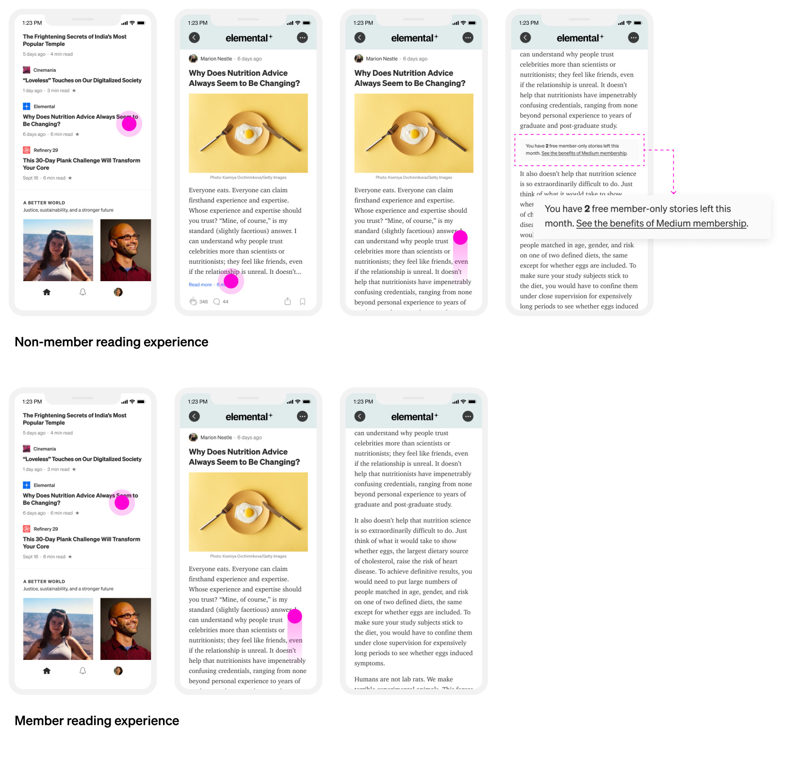
As the core app experience took shape, we started addressing other key app experiences that were critical for launch. One of these was the experience for non-member users, who can only read a limited number of paywalled stories each month. Non-members need to be crystal clear on how many stories they have left before having to upgrade to a paid membership and they should never use up their free story by accident. To address this, I intentionally added some friction to the non-member reading experience so they’re in control of their reading choices on Medium.
Medium’s product changes were accompanied by an evolved brand that conveys the openness of the platform, which is integral to Medium’s future direction. I collaborated with the brand team to design and implement this brand language across various product surfaces.
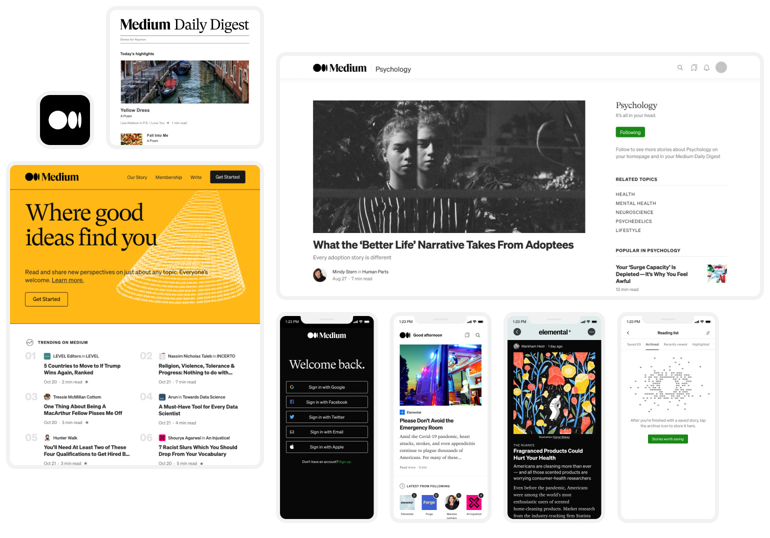
Additional designs by Abby Aker (email digest) and Ryan Hubbard (web homepage).
Medium’s own brand wasn’t the only thing that changed. As designers on the reader experience group worked through the app designs, there was a parallel effort happening on the creator side to enable more expressiveness through customizations. This would result in a better sense of brand, place, and context for creators and their work on Medium.
Naturally, the creator’s creative decisions needed to be translated into the app so readers could experience it as they read content from various writers and publications. Due to technical constraints, we decided that the app’s official first version would only show key parts of the customization (with future plans to implement themes in full).
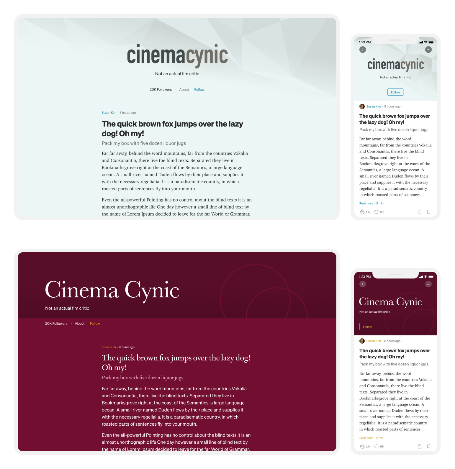
All the product and brand changes that happened during this process strained our existing design system. Some of the components, semantics, and structure we had been using no longer served our product needs and consequently, we decided to make some fundamental updates to the system, including accessibility improvements. I then conducted an audit across all our product surfaces and stress-tested the proposed changes to ensure that the system was robust enough for current uses and flexible enough to accommodate future changes.
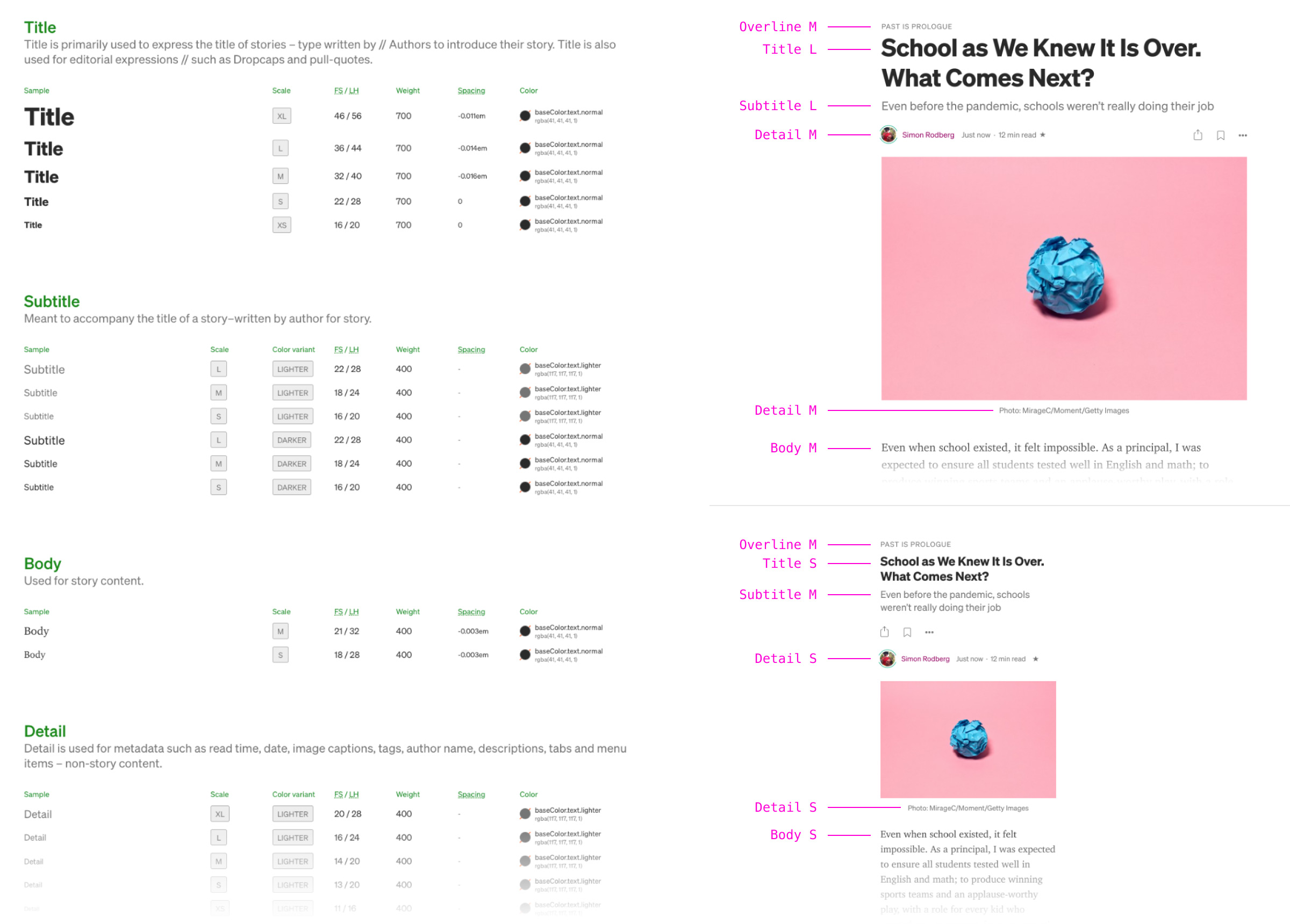
After months of hard work, our grand effort culminated in a public launch in October 2020.
Medium has grown to become a place where millions discover insightful ideas and stories each day. The new app experience continues to serve those millions of users, but also builds upon it by enabling stronger connections between readers and creators. By placing more emphasis on following, readers won’t miss out on new content from writers and publications they love and, conversely, creators are able to build, engage, and nurture their audience on Medium.
The release was a major step forward in Medium’s evolution as a platform, though it’s certainly far from the end. More importantly, however, it reflects Medium’s continuing march towards its core mission to deepen people’s understanding of the world and spread ideas that matter.
